Rule of Thirds in Mountain Photography: Composition, Framing, and Examples
Updated July 4, 2026
Mountain Photography Technical Guide
This article is part of the Mountain Photography Techniques page, which compiles my field advice on light, composition, settings, reflections, blue hour, the Milky Way, and mountain weather conditions.
To choose the best locations to apply these tips in the Alps, also consult the Alpine Photo Destinations page.

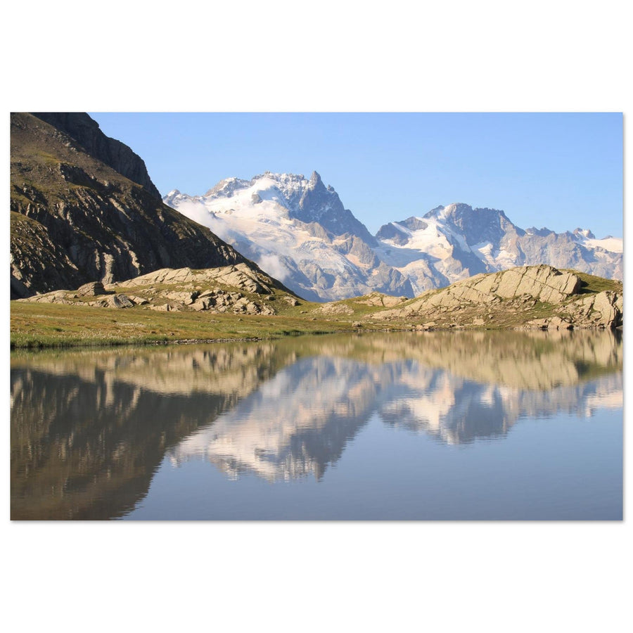
Mont-Blanc reflection in Lake Chéserys — an example where symmetry can override the rule of thirds. View this print →
Reading time: 15 to 18 min
Level: beginner to intermediate
Ideal season: all year round
Recommended equipment: camera with grid activated, wide-angle lens, telephoto lens, tripod depending on light
Objective: understand the rule of thirds in mountain photography, know how to use it for clearer composition, and especially know when to go beyond it.
The rule of thirds is one of the first rules learned in photography. It consists of dividing the image into nine equal zones using two horizontal and two vertical lines, then placing important elements along these lines or at their intersections.
In mountain photography, this rule can be very useful. It helps to position a summit, a horizon, a refuge, a lake, a silhouette, or a ridgeline in a more balanced way. It also avoids compositions that are too centered, too flat, or too cluttered.
In the Alps, landscapes are often complex: sky, summits, glaciers, lakes, forests, rocks, trails, clouds, and foregrounds overlap. The rule of thirds helps organize this visual richness to make an image more readable, especially when it is intended for a wall print or a mountain photo print.
But to be clear: the rule of thirds is not a magic formula. A good landscape photo does not become strong simply because the horizon is placed on a line. Some alpine images work better with perfect symmetry, a centered summit, a panoramic format, or a minimalist composition.
Since my first mountain photo outings, I have learned to use the rule of thirds as a reading tool, not as a constraint. It helps organize an image. It should never replace the intention, the light, the natural lines, or the emotion of the place.
In this comprehensive guide, I will show you how to apply the rule of thirds to mountain photography: horizon, foreground, summits, leading lines, reflections, silhouettes, common mistakes, post-processing, and case studies with my own alpine images.
The essentials in 30 seconds
| Definition | Divide the image into 9 zones with 2 horizontal and 2 vertical lines. |
|---|---|
| What is it for? | Place horizon, summit, refuge, silhouette or foreground more balanced. |
| In the mountains | Very useful for ridges, valleys, lakes, vanishing lines and isolated subjects. |
| Main mistake | Applying the rule mechanically without considering light, relief or subject. |
| To remember | The rule of thirds is a starting point. A good composition remains primarily a clear intention. |
Summary
- What is the rule of thirds?
- Why it works in mountain photography
- How to prepare your composition in the field
- Where to place the horizon in the mountains
- Using strong points
- Composing with natural lines
- Integrating a foreground
- When to go beyond the rule of thirds
- Case studies with my photos
- Cropping and correcting in post-processing
- Common mistakes to avoid
- Where to apply the rule of thirds in the Alps?
- From composition to mountain photo print
- The 5 key takeaways
- Continue your progress
- FAQ
What is the rule of thirds?
The rule of thirds consists of imagining a grid over the image: two vertical lines, two horizontal lines, and four intersection points. These intersections are often called power points.
The idea is simple: instead of systematically placing your subject in the center, you can position it on a line or on a power point. This often creates a more dynamic, balanced, and visually pleasing image.
Simplified diagram
┌─────────┬─────────┬─────────┐
│         │         │         │
│    •    │         │    •    │
├─────────┼─────────┼─────────┤
│         │         │         │
│         │         │         │
├─────────┼─────────┼─────────┤
│    •    │         │    •    │
│         │         │         │
└─────────┴─────────┴─────────┘
The lines are used to place the horizon, ridges, valleys, or main masses. The points are used to place a strong subject: summit, refuge, silhouette, tree, ibex, moon, or luminous element.
In mountain landscapes, the rule of thirds is particularly useful because scenes are often very wide. Without structure, the eye can get lost. The grid helps prioritize: what really matters in the image? The sky? The summit? The foreground? The reflection? The valley?
Why it works in mountain photography
A mountain photo often contains a lot of information: sky, summits, forests, rocks, snow, lakes, trails, clouds, sometimes a human presence. The rule of thirds helps organize these elements.
It works well for three reasons.
It creates visual balance
Placing the horizon too high or too low without intention can unbalance the image. By using a rule of thirds line, you give a clear place to the sky or the ground. The image becomes more readable.
It avoids automatic centering
When starting out, we often place the summit in the center. This is not always bad, but it can make the image static. Slightly moving the subject to a power point often gives more tension and space.
It guides the eye
The rule of thirds lines can follow the natural lines of the landscape: ridges, valleys, roads, rivers, tracks in the snow. The eye then moves more easily through the image.
💡 Field tip
Before pressing the shutter, ask yourself: “What is the main subject?” If you can't answer clearly, the rule of thirds won't save the image. It organizes an intention, it doesn't create it for you.
How to prepare your composition in the field
A good composition is built before pressing the shutter. The rule of thirds becomes truly useful when you take a few seconds to read the landscape.
Activate the grid in the viewfinder
Most cameras and smartphones allow you to display a 3x3 grid. I recommend activating it permanently, especially in landscape photography. It helps to quickly check the horizon, verticals, and the position of the main masses.
In the field, I mainly use it as a guide. I don't try to perfectly align a ridge with a line. I'm looking for an overall balance.
Identify the main masses
Before composing, identify the large masses in the image: sky, mountain, valley, lake, snow, forest, rocks, foreground. Then, decide which one should dominate.
If the sky is spectacular, it can occupy two-thirds of the image. If the foreground is strong, it can take up more space. If the summit is the true subject, it can be placed on a power point.
Take two shots
I recommend systematically taking two versions: one "rule of thirds" composition and one more free composition. On screen, the difference may seem slight. When selecting the final image, it often becomes obvious.
📷 My simple method
I start by placing the horizon according to the intention: strong sky or strong ground. Only then do I position the main subject on a line or a power point. I never do the opposite.
Where to place the horizon in the mountains
Horizon placement is probably the simplest and most useful application of the rule of thirds.
Horizon on the lower third: giving space to the sky
If the sky is spectacular — clouds, storm, sunset, alpenglow, Milky Way, sea of clouds — you can place the horizon on the lower line. The sky then becomes the main subject.
This framing works well when the upper part of the image truly adds something. If the sky is empty, it may, on the contrary, weaken the photo.
Horizon on the upper third: giving strength to the ground
If the foreground is interesting — lake, rocks, flowers, snow, tracks, path, texture — place the horizon on the upper line instead. This gives more space to the ground and adds depth.
In the mountains, this choice is often very effective with wide-angle lenses. The foreground becomes a gateway to the summit.
Centered horizon: to be used with intention
The rule of thirds often recommends avoiding a centered horizon. However, in the mountains, a centered horizon can be excellent in certain cases: perfectly symmetrical reflection, minimalist composition, mirror lake, sky and ground of equal importance.
The center is not forbidden. It simply needs to be justified.
Using strong points
The power points correspond to the four intersections of the grid. They are useful for placing a precise element without centering it.
Main summit
An isolated summit, like the Matterhorn, La Meije, or a very recognizable peak, can be placed on a power point. This gives it importance while allowing the surrounding landscape to breathe.
Human silhouette
A mountaineer, hiker, or skier can become a very powerful subject if placed on a power point. The person gives scale, but does not take up all the space.
Refuge, tree or isolated element
A refuge in a valley, a lone tree, a chapel, a cairn, or a light from a chalet can also be placed on a power point. These elements draw the eye.
⚠️ Common mistake
Don't place an element on a power point simply because the grid indicates it. The subject must have real visual importance: shape, light, color, contrast or narrative value.
Composing with natural lines
Mountains are full of lines: ridges, arêtes, valleys, rivers, trails, roads, ski tracks, boundaries between shadow and light. These lines are sometimes more important than the grid itself.
Ridges and arêtes
A ridge can follow a rule of thirds line or start from a corner of the image to guide the eye towards a summit. This is a very strong structure in mountain photography.
Valleys and roads
A valley or a road can create a leading line. If this line starts near a third or leads to a power point, the composition becomes much more readable.
Shadows and light
Transitions between warm light and cool shadow also create lines. At sunrise or sunset, these separations can structure the entire image.
The rule of thirds therefore does not replace natural lines. It accompanies them. A good composition often uses both.
Integrating a foreground
The foreground is essential in mountain photography, especially with wide-angle lenses. It adds depth and prevents the image from looking like a simple distant postcard.
Foreground on the lower third
Rocks, flowers, snow, grass, a lake, tracks, or the edge of a path can occupy the lower third. The eye then enters the image before moving up towards the summits.
Beware of unnecessary foreground
A foreground must serve the image. If it is messy, too dark, or unrelated to the subject, it weighs down the composition.
Vertical format
The vertical format works very well when the foreground is strong. It allows for a clear progression: foreground, midground, summit, sky.
When to go beyond the rule of thirds
The rule of thirds is useful, but it should not become automatic. Some images become stronger precisely because they do not respect it.
| Situation | Why go beyond the rule? | Possible composition |
|---|---|---|
| Perfect reflection | Symmetry is the main subject. | Centered horizon. |
| Very graphic summit | The shape deserves a frontal reading. | Centered or nearly centered subject. |
| Minimalism | Empty space becomes part of the image. | Very low or very high composition. |
| Panorama | The reading is based on width and successive planes. | Dominant horizontal lines. |
| Very dynamic scene | Natural lines take precedence over the grid. | Diagonals, curves, roads, tracks. |
True progress involves knowing the rule, using it when it helps, then forgetting it when another structure works better.
Case studies with my photos
Mont-Blanc reflection in Lake Chéserys. View this print →
📷 Composition analysis
Structure: horizon near the center · Subject: Mont-Blanc and its reflection · Desired effect: symmetry and stability
Objective: to show that a centered composition can be stronger than the rule of thirds when the reflection becomes the main subject.
Why this photo works
This image works because the symmetry is clear. The lake acts as a mirror, and Mont-Blanc is reflected in the water. Here, placing the horizon in the center is not a mistake: it is the main intention.

Matterhorn, Swiss Alps. View this print →
📷 Composition analysis
Structure: dominant graphic subject · Subject: pyramidal summit · Desired effect: power and readability
Objective: use the shape of the summit as the main anchor point, without cluttering the frame.
Why this photo works
The Matterhorn is naturally graphic. Its pyramidal shape immediately draws the eye. In this type of scene, the rule of thirds can help leave space around the summit, but clarity of form remains the priority.

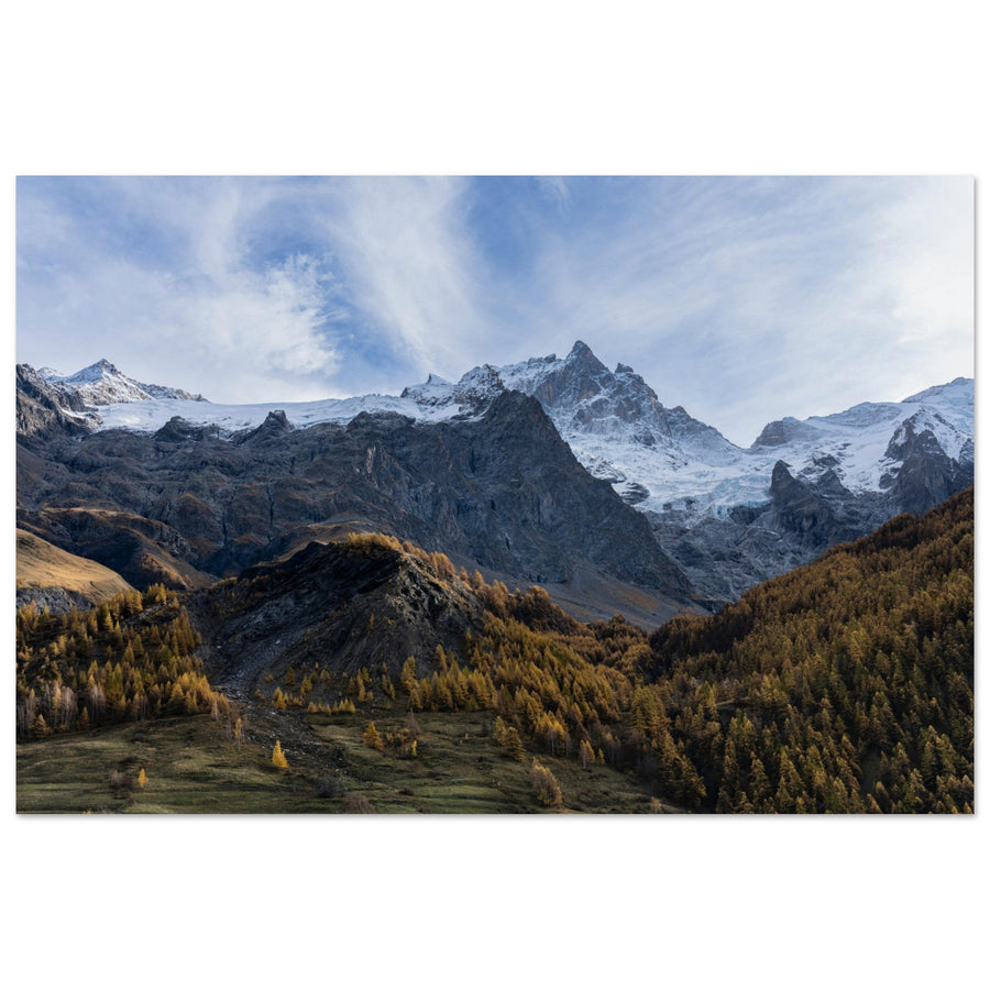
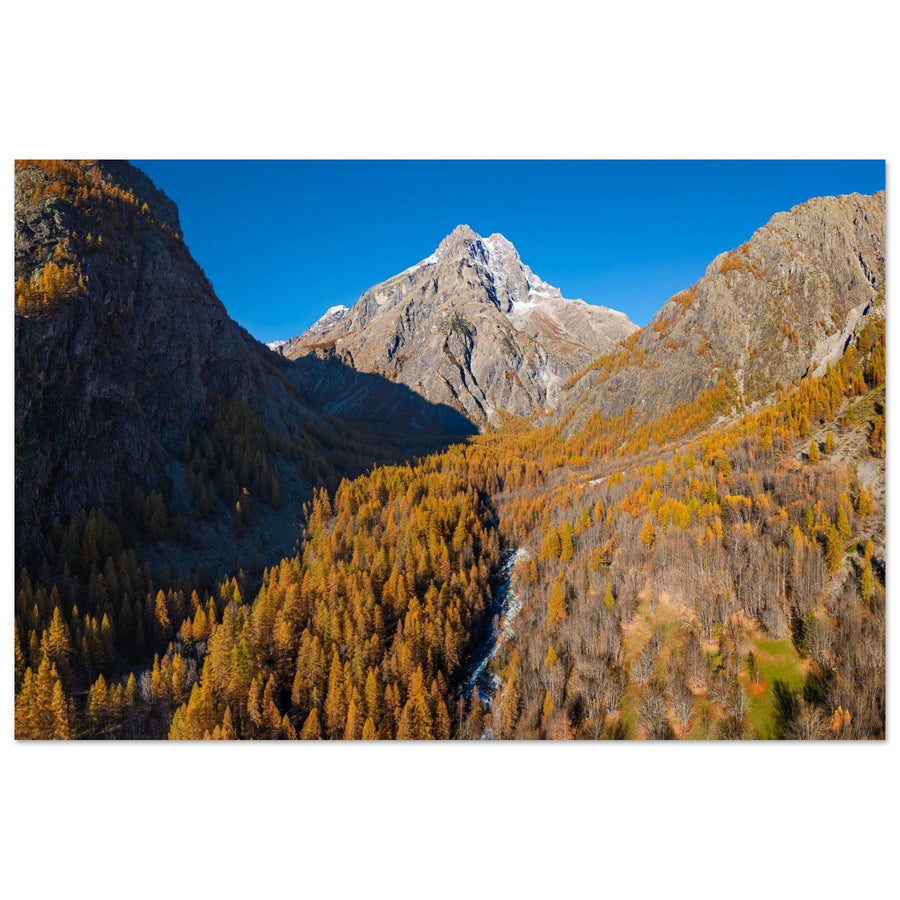
Vanoise National Park in autumn. View this print →
📷 Composition analysis
Structure: successive planes · Subject: relief, season and depth · Desired effect: progressive gaze
Objective: use natural lines and masses of color rather than limiting oneself to a theoretical grid.
Why this photo works
The strength of this image comes from its layers: foreground, slopes, summits, sky. The rule of thirds can help distribute these masses, but it's the successive planes that create depth.
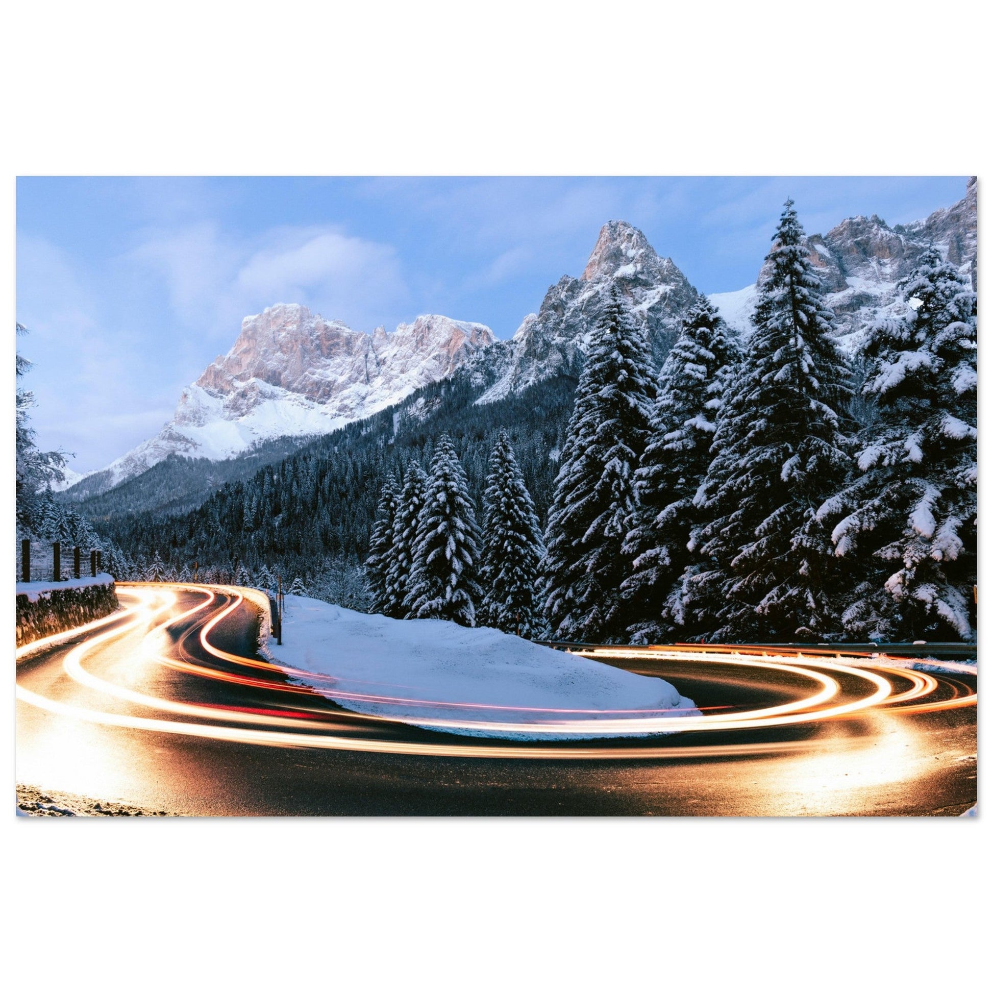
Light trails on a mountain road. View this print →
📷 Composition analysis
Structure: leading line · Subject: road, light, and relief · Desired effect: movement
Objective: to show that natural lines can be more important than power points.
Why this photo works
The road guides the eye. The light trails give a very clear direction to the image. Here, the rule of thirds is secondary: the composition relies primarily on the curve and movement.
Cropping and correcting in post-processing
The rule of thirds can also be used after shooting, during cropping. This is often where you most clearly see what works or doesn't.
- Straighten the horizon before any cropping.
- Test a horizon on the upper third, then the lower third.
- Check if the main subject benefits from being off-center.
- Remove unnecessary edges that draw the eye.
- Adapt the framing to the final format: horizontal, vertical, square, panoramic.
Cropping is not a failure
Cropping a photo is not a mistake. It's a normal part of the editing process. Some images gain a lot simply by removing an empty sky, an unnecessary roadside, or an overly present dark mass.
Beware of the final format
A composition designed for Instagram does not always work as a wall art print. A large horizontal format often requires more breathing room, while a vertical format can reinforce a foreground or a silhouette.
Don't force the grid
If the image works better centered, keep it centered. The grid should help you decide, not force you to obey.
Common mistakes to avoid
| Mistake | Consequence | Solution |
|---|---|---|
| Applying the rule mechanically | Correct image but without intent. | First define the main subject. |
| Placing the horizon thoughtlessly | Sky or foreground too dominant. | Choose based on what adds most to the image. |
| Centering by default | Static or flat photo. | Test a subject on a strong point. |
| Decentering without reason | Unbalanced image. | Leave space in the direction of the gaze or movement. |
| Forgetting natural lines | Confusing composition. | Use ridges, roads, valleys, tracks or rivers. |
| Ignoring the final format | Less impactful image when printed or on mobile. | Crop according to actual use. |
Where to apply the rule of thirds in the Alps?
The Alps are an excellent playground for working with the rule of thirds, as the landscapes naturally offer strong lines, planes, and subjects: ridges, lakes, refuges, glaciers, cliffs, mountain roads, silhouettes, and isolated peaks.
To choose a mountain range based on the type of composition you're looking for, you can start from the Alpine photo destinations page, which compiles my field guides by range.
Aiguilles Rouges and Mont-Blanc: reflections, summits, and symmetries
The Aiguilles Rouges are ideal for understanding the limits of the rule of thirds. With Lac Blanc or the Lacs des Chéserys, the symmetry of the reflection can sometimes become stronger than an offset horizon. Mont-Blanc, on the other hand, works very well as a main subject, to be placed in the center or on a power point depending on the intention.
Vanoise and Écrins: successive planes and powerful relief
The Vanoise and the Écrins are excellent for working with planes: mineral or grassy foreground, valley, refuge, summit, sky. The rule of thirds helps distribute these masses to avoid an image that is too dense or too flat.
Chartreuse, Vercors and Aravis: lines, cliffs and atmospheres
The Chartreuse and Vercors allow you to work with cliffs, forests, mists and limestone lines. The Aravis are very interesting for ridges, chalets, alpine pastures and soft lines in golden light.
Destination guides to consult
- All Alpine photo guides
- Where to photograph the Aiguilles Rouges? — for reflections, viewpoints, and compositions facing Mont-Blanc.
- Where to photograph Mont-Blanc? — for iconic peaks, glaciers, and large-format compositions.
- Where to photograph the Vanoise? — for refuges, lakes, open valleys, and successive planes.
- Where to photograph the Écrins? — for powerful relief, glaciers, and wild compositions.
- Where to photograph the Chartreuse? — for forests, mists, cliffs, and atmospheric compositions.
- Where to photograph the Vercors? — for cliffs, plateaus, and limestone silhouettes.
- Where to photograph the Aravis? — for alpine pastures, chalets, ridges, and warm alpine landscapes.
Make several versions in the field
At the same spot, take a centered version, a version with a low horizon, a version with a high horizon, then a vertical version. This method leads to much faster progress than a single instinctive framing.
From composition to mountain photo print
A photo intended to become a wall art print must be more than just beautiful light. It must remain legible from a distance, balanced in a given format, and pleasant to look at for a long time.
Composition therefore plays a central role. A well-placed ridge, a stable horizon, a breathing summit, a clear foreground, or a balanced reflection makes the image stronger in large format.
On aluminum Dibond, details, lines, and masses become very visible. A rough composition may seem acceptable on a phone, but lose its balance once printed. This is why I select images not only for their light, but also for their structure.
- The most beautiful mountain images
- Panoramic photo prints of the Alps
- Mountain lake photo prints
- Alps photo prints for living rooms & large walls
- Alps photo prints for offices & professional spaces
- Request a wall simulation
Photos cited in this guide
- Reflection of Mont-Blanc in Lac des Chéserys
- Matterhorn, Swiss Alps
- Vanoise National Park in autumn
- Light trails on a mountain road
The 5 key takeaways
| 1 | The rule of thirds helps organize the image, not automatically make it strong. |
|---|---|
| 2 | Place the horizon according to intention: strong sky, strong foreground, or symmetry. |
| 3 | Use strong points to place a summit, refuge, silhouette, or isolated element. |
| 4 | Natural mountain lines are often more important than the grid. |
| 5 | A good composition can respect the rule, but also transcend it with intention. |
Continue your progress
The rule of thirds is a basic composition principle. To improve in mountain photography, it must be connected to other field situations: reflections, sunrise, sunset, blue hour, and choosing the right mountain range.
Mountain photography techniques
The central page to find all technical guides: light, composition, settings, reflections, Milky Way, and weather.
Photographing alpine reflections
Understand when to center the horizon, when to offset the reflection, and how to compose with an alpine lake.
Photographing mountains at sunrise
Compose with the blue hour, first light, ridges, and illuminated peaks.
Photographing mountains at sunset
Use grazing light, long shadows, and warm/cold masses to compose.
To choose locations suitable for these compositions, you can also consult the Alpine Photo Destinations page.
FAQ — Rule of thirds in mountain photography
Is the rule of thirds mandatory in landscape photography?
No. It's a compositional aid, not an obligation. It works very well for organizing an image, but some photos are stronger with symmetry, a centered subject, or a minimalist composition.
Where to place the horizon in mountain photography?
If the sky is strong, place the horizon on the lower third. If the foreground is more interesting, place it on the upper third. If the reflection is perfectly symmetrical, a centered horizon might be better.
How to use the power points?
Power points are used to place an important element: summit, refuge, silhouette, tree, moon, or light. The subject must be visually strong; otherwise, the placement alone will not suffice.
Should the grid be activated in the camera?
Yes, it's very useful. The grid helps check the horizon, balance masses, and quickly test several frames.
When should the rule of thirds be broken?
It should be transcended when symmetry, natural lines, minimalism, or the shape of the subject create a stronger composition than the grid.
Does the rule of thirds work for vertical formats?
Yes. In a vertical format, it helps organize the progression between the foreground, main subject, and sky. It is particularly useful with a path, a track in the snow, a silhouette, or a dominant peak.
About the author
I'm Pierre Thiaville, mountain photographer and founder of Alu Art Mountains. Since 2017, I've been photographing the alpine landscapes — Mont-Blanc, Aiguilles Rouges, Vanoise, Écrins, Aravis, Chartreuse, Savoie, Haute-Savoie, and Swiss Alps — with particular attention to light, composition, relief, and printing on aluminum Dibond. The advice in this guide comes directly from my field trips and my work selecting images for large-format printing.
Conclusion
The rule of thirds is an excellent tool for improving mountain photography. It helps place the horizon, structure masses, give space to the subject, and make the image more legible.
But it is not an absolute rule. The best alpine landscapes often arise from a more subtle balance: light, relief, natural lines, foreground, atmosphere, and intention. The rule of thirds provides a foundation. The terrain itself often dictates the best framing.
To continue improving, you can return to the Mountain Photography Techniques page or choose a mountain range to explore from the Alpine Photo Destinations page.
If you appreciate strong compositions and balanced alpine landscapes, you can explore my selection of mountain photo prints, printed on aluminum Dibond to bring this visual structure into your home.