Photographing mountains in black and white
Photographing mountains in black and white is not about removing saturation from a colour image that does not work. The choice becomes interesting when the scene keeps — or gains — a clear hierarchy without colour: a shape, light, a succession of planes, texture, rhythm or an opposition of tonal values can then carry the image.
Black and white is not inherently more artistic, more timeless, more dramatic or more “premium”. The first decision is therefore not “which black-and-white look should I apply?” but “what is colour doing in this photograph right now?”. If colour separates the subject from the background, creates a warm/cool opposition or carries the main information, removing it can weaken the image. If it attracts attention toward secondary elements or adds nothing to an already strong structure, monochrome can instead simplify the reading.
The method in this guide follows that logic: first test whether the image survives without colour, learn to read the tonal values that will replace it, use a monochrome preview at capture if useful without locking the file into that rendering, then deliberately convert the recorded colours into grays. Contrast, local adjustments and grain come only after the hierarchy.
If colour carries the subject, removing it can be a loss. Black and white is never an automatic upgrade.
Two different colours can become similar grays; the hierarchy must be checked without colour.
On a compatible colour camera shooting RAW, a monochrome preview can help you read values without necessarily locking in the final rendering.
Mapping source colours to grays lets you build deliberate tonal separation, and only then adjust contrast and texture.
1. Decide whether black and white genuinely serves the scene
The best test is deliberately simple: imagine that all hue information disappears. What remains capable of attracting the eye and organizing the image?
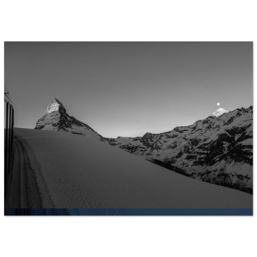
A ridge outlined against a bright sky, slopes alternating between light and shadow, layers of relief revealed by the atmosphere, a highly textured wall or a repetition of summits can work almost independently of their colour palette. Conversely, a small red tent in a chaos of rock, yellow larches against a dark forest or an opposition between bluish snow in shade and warm rock in sunlight can lose their hierarchy when the colours become similar grays.
Black and white is often interesting in four families of situations:
- colour is weak, repetitive or distracting while shapes already provide structure;
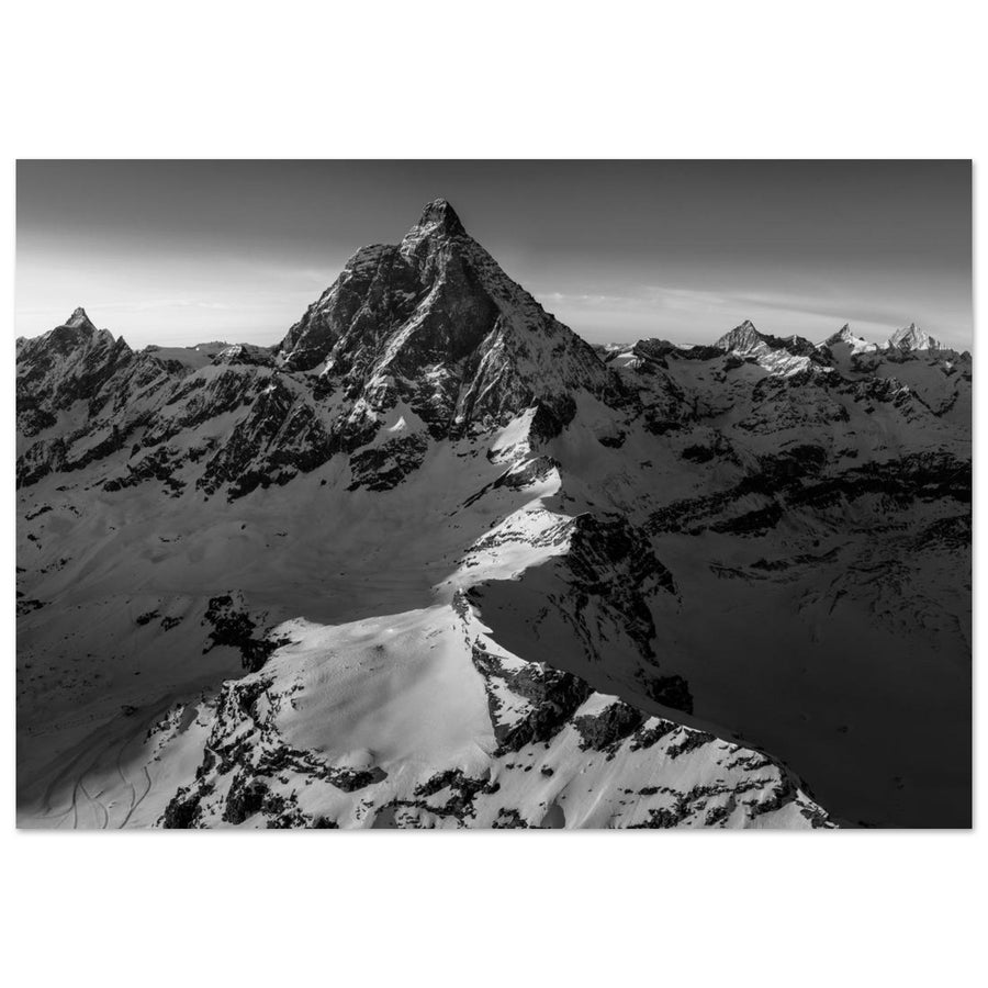
- light strongly organizes volume, silhouettes or texture;
- the subject relies on rhythm, repetition, masses or successive planes;
- weather or atmosphere has almost already reduced the scene to a tonal range: fog, snow, overcast sky, dark rock, haze or silhouette.
None of these situations is a rule. Diffuse light can produce a beautiful monochrome image or a flat one. A very colourful scene can become excellent black and white if those colours provide enough distinct information to be remapped into clearly separated values. The criterion remains the result: what does conversion clarify, and what does it remove?
When to keep colour
Keep colour when removing it destroys information that tonal contrast cannot replace cleanly.
This is especially true when:
- a warm/cool opposition provides the main depth or atmosphere;
- two subjects with similar luminance remain distinct mainly because of hue;
- a small isolated colour is the main point of attention;
- colour describes a genuinely important condition of the scene — autumn vegetation, pink light on a face, turquoise water, for example;
- conversion merely adds spectacular contrast without improving the subject.
The right reflex is therefore not to defend black and white. It is to be ready to abandon it.
Decision matrix
| Situation | Monochrome test | Main risk | Decision |
|---|---|---|---|
| Weak colour, very strong shape | Mentally remove colour and look at the contours | Image becomes too simple if shape alone is not enough | B&W often worth testing |
| Two elements separated mainly by hue | Check their value without colour | Subject/background merge | Keep colour or use justified tonal remapping |
| Dominant warm/cool relationship | Make a temporary conversion | Loss of light information | Colour often preferable |
| Texture and side light provide structure | Observe the material in gray | Overprocessing of texture | B&W possible, contrast to be controlled |
| Haze or successive planes | Look at the value difference between layers | Everything collapses into the same gray | B&W useful if tonal depth remains readable |
| Spectacular sky but weak subject | Reduce the image to thumbnail size | Processing becomes the only subject | Reconsider the photograph before the conversion |
2. Colour, luminance and tonal value: do not confuse the concepts
Colour contains several dimensions: hue, colour intensity and apparent brightness. Black and white removes visible hue from the final result, but still has to assign a light or dark value to every area.
Relative luminance is a standardized measure of the brightness of a rendered colour in a given space; it is not identical to every nuance of human lightness perception. In a space such as sRGB, red, green and blue components do not contribute equally: green has greater weight in relative luminance than blue. For the photographer, one important conclusion follows: two very different colours do not necessarily become two very different grays.
In this guide, tonal value means the final gray assigned to an area after conversion. That value does not have to remain exactly what a neutral conversion would produce. A black-and-white mixer can lighten areas derived from one colour family and darken others. Tonal contrast is then the difference between those values.
This distinction prevents two mistakes:
- believing that “red against green” will automatically remain separated in black and white;
- believing that a conversion must reproduce a single “true” luminance and that adjusting grays would somehow be wrong.
Two different colours can merge
Imagine a coloured garment in front of a slope of a different hue. In colour, both areas can be immediately distinct. If their tonal values are close, a simple conversion can place them in almost identical grays. The subject then loses isolation.
Conversely, if the two colour families are sufficiently distinct in the recorded data, a black-and-white mixer can sometimes lighten one and darken the other. This does not mean you should always force separation: if colour was the main information, the colour version may remain better.
Field test: read values before pressing the shutter
If your camera allows a monochrome preview in the electronic viewfinder or on the screen, use it as a hierarchy test. Look at:
The aim is not to decide the final rendering on the camera screen. It is to discover what colour was hiding or supporting.
3. Use a monochrome preview without locking the file
On a colour camera recording RAW, a Picture Style, Picture Control, film simulation or monochrome profile generally affects the rendered preview, any JPEG and rendering metadata, while the sensor’s RAW data remain available for reinterpretation. Nikon, for example, documents that Picture Controls are stored separately from the raw data in NEF files, and Canon allows Picture Styles to be reapplied or changed during RAW processing in its tools.
This idea needs boundaries: exact names, options and behaviours vary by manufacturer, and third-party RAW software may not reproduce the camera rendering identically. The useful principle is therefore: on a standard colour camera and in a compatible RAW workflow, a monochrome profile can serve as a preview without forcing you to deliver that rendering.
A camera with a native monochrome sensor is a different case and is not the subject of this guide.
RAW, JPEG and RAW+JPEG
RAW only with monochrome preview: a flexible solution for judging values in the field while retaining the data needed for later conversion.
Monochrome JPEG only: the file is already rendered in grayscale. You lose the ability to return to the same level of chromatic information to remap the original colours separately.
RAW+JPEG: can be useful if you want to keep an immediate reference of the rendering you saw in the field in addition to the RAW. The main cost is storage and extra file management; it is not a photographic necessity.
Be careful with the histogram
For general exposure, stay with the method from the Exposure guide: protect the highlights and shadows that genuinely matter, then check the file. There is no special “black-and-white exposure compensation”.
4. What the absence of colour changes in composition
The general rules of subject, masses, balance, lines, edges and space belong in the Composition guide. Here the question is narrower: what changes when colour stops contributing to their visual weight?
A small red area can carry enormous weight in a colour photograph, then become an ordinary gray. A ridge that stood out because of a hue difference can merge with the next plane. Conversely, a rock texture or repeated shadow that was secondary before can become the new dominant element.
Rebuild the hierarchy after conversion
After a first monochrome preview, ask four questions:
- does the subject remain the most readable element?
- does a secondary area become lighter or darker than expected?
- do two planes that were distinct in colour merge?
- does a textured detail become too important because colour no longer balances it?
This check is especially useful in dense mountain scenes. The brain knows the scene in three dimensions and recognizes materials easily. Conversion can reduce several surfaces to similar values. The structure must therefore be judged as a self-contained image.
Shapes, rhythms and textures: more visible does not mean better
Monochrome can make a repetition of ridges more obvious, strengthen the presence of a crest or reveal snow texture. But if every texture is strengthened at once, they compete with one another.
Good black and white does not try to make every rock “interesting”. It decides which shapes are allowed to dominate.
5. Use light for a monochrome intention without repeating the full light theory
The Understanding Light guide owns the physics of direction, diffusion, contrast and atmosphere. In black and white, these phenomena are especially interesting through the values they create.
Side light: texture and volume
Side or grazing light can alternate small light and dark areas across a wall, glacier or moraine. It often makes texture more visible. If material is the subject, this structure can become very strong in monochrome.
The trap is to double that effect afterward with too much texture, clarity and sharpening. If the light has already sculpted the rock, development does not need to turn it into an abrasive surface.
Backlight: silhouette and simplicity
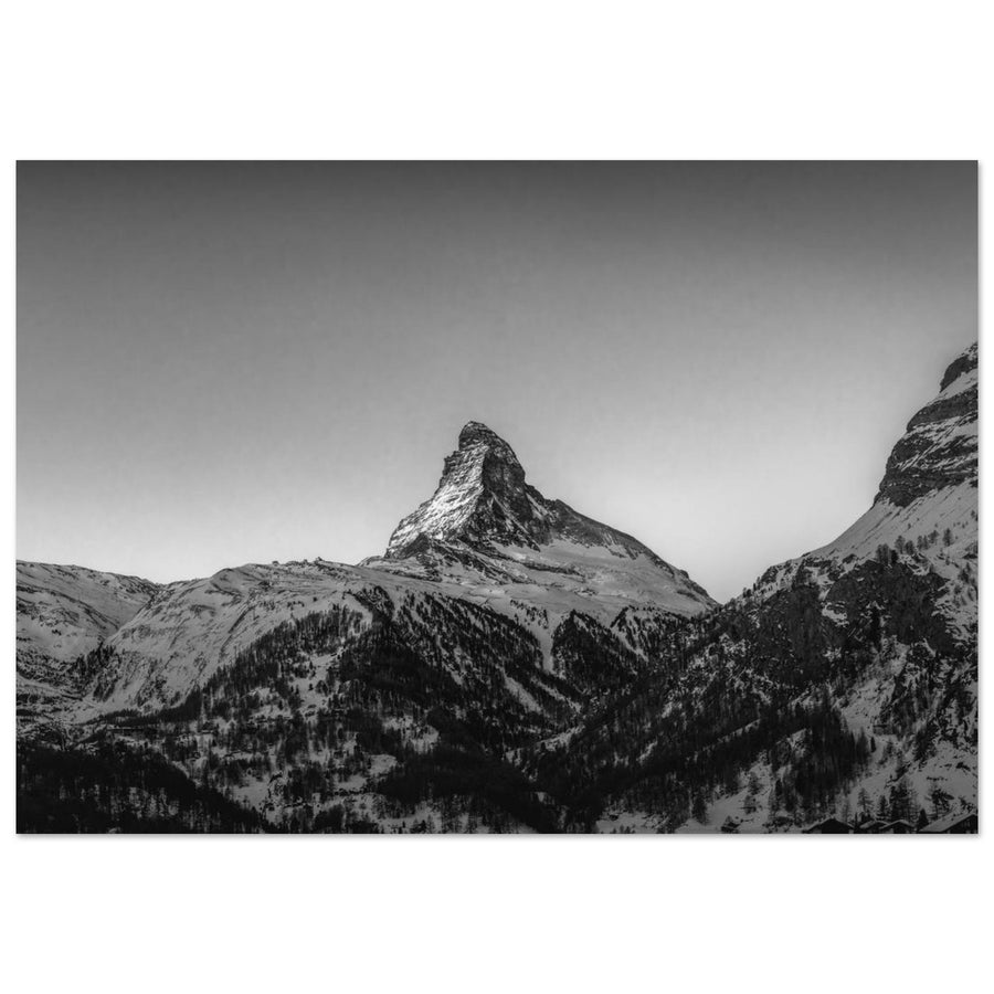
Backlight can reduce a mountain to a silhouette, emphasize a ridge or transform haze into luminous layers. This simplification works well when the shape itself is strong.
It fails if you were relying on the material of the visible face: conversion cannot invent volume that did not receive enough light or signal.
Diffuse light: fine transitions
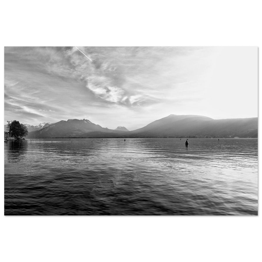
Diffuse light is not “too flat for black and white”. It can create long transitions between grays, gently separate snow, rock and cloud or provide a great deal of material in an overcast landscape.
It becomes weak when all important areas end up with values that are too close. The diagnosis is therefore not “soft light = good B&W”, but “is there still a tonal organization?”.
Atmosphere: depth without colour
Haze, veil and scattering often reduce contrast in distant planes. In colour, this depth may also be carried by hue differences. In black and white, it relies more on a progression of values.
Do not automatically remove that atmosphere with strong dehazing: it may be precisely what separates the planes.
6. Convert: remap colours into grays instead of merely desaturating
Desaturation removes colour intensity according to the software’s logic, but does not necessarily give you fine control over how each colour family becomes a gray.
A black-and-white mixer, by contrast, lets you lighten or darken the grays corresponding to colours present in the original. Adobe, for example, provides sliders by colour family and a targeted tool for changing the grays derived from selected colours.
The principle matters more than the tool’s name.
Conversion method
- Start from a relatively neutral black-and-white rendering.
- Identify the two or three separations that genuinely serve the subject.
- Identify which colour families carry them in the original file.
- Modify those families progressively.
- Check the whole image: the same colour can appear in several different areas.
- If a setting helps the subject but damages the image elsewhere, use a local mask instead of pushing the global slider.
- Return to a smaller view to confirm that the hierarchy remains readable.
A slider does not know the subject
Darkening blues can give clouds more presence, but can also darken blue snow shadows or other bluish elements in the relief. Lightening yellows can separate dry grass from rock, but may also affect warm light on a face.
The mixer works on colour families, not your intentions. That is why conversion must remain controlled by the subject.
Physical colour filters and digital “filters”
A physical coloured filter placed in front of the lens modifies the spectrum — and generally the amount of light — reaching the sensor before recording. Its effect is therefore part of capture and is not reversible like a software adjustment.
The yellow, orange or red “filters” offered in some camera monochrome modes or software are rendering transformations. They can be useful for previewing a tonal relationship, but they are not the same as a physical filter.
7. Build tonal hierarchy before local contrast
A strong conversion does not need absolute black and pure white in every image. Some scenes work with a very wide range; others deliberately remain bright or dark.
The first question is: which large masses should dominate?
Place first:
- the important highlights;
- the shadows that must retain material;
- the areas that can become decisively dark or bright;
- the midtones that separate planes.
A curve or global contrast adjustment can then reinforce those relationships. Avoid crushing transitions merely to display a “full” histogram.
A deliberately very bright or very dark rendering can be coherent if the scene and subject call for it. These are not “black-and-white recipes”: a bright image does not need artificially deep shadows, and a dark image does not need to sacrifice the few details that structure the subject.
Blocked black and pure white: flaw or choice?
A small black silhouette can be perfectly coherent. A very bright area of snow can also stay close to white. The problem appears when clipping destroys essential information or is merely the consequence of over-pushed automatic contrast.
As with exposure, not every histogram extreme is an error.
Lighten and darken locally
Local lightening and darkening can serve a monochrome photograph when the purpose is clear:
- slightly separate a subject from its background;
- calm an overly bright edge;
- reinforce a band of light that already exists;
- give continuity to a succession of planes.
They become artificial when they create spotlights that no longer correspond to the scene’s light or when they standardize every area according to a local idea of “perfection”.
8. Sky, clouds, texture and halos: the most visible excesses in black and white
Black and white handles a bright, gray or almost white sky perfectly well if it serves the image. There is no obligation to turn the original blue into a very dark gray.
A black sky is not proof of good black and white
Strongly darkening blues can produce a spectacular sky around a bright mountain. That rendering can work, but quickly becomes a convention applied by reflex.
Ask three questions:
- does the sky genuinely need more visual weight?
- does the sky/relief relationship remain believable?
- does the transition around ridges stay clean?
If the sky becomes the first subject when the mountain was meant to dominate, the conversion has changed the intention.
Clouds: keep structure without turning every detail into relief
Local contrast can make clouds easier to read. Pushed too far, it produces a grainy, dark and overly prominent sky. The right amount is the amount needed to reveal structures that matter to the frame.
Ridge halos
Check ridges at 100%, then return to output size. If the effect appears only at pixel level but disappears in the final output, it does not carry the same weight as an obvious halo in the finished image. If it remains visible as a thumbnail, the correction is very likely too strong.
Texture: avoid “crunchy” rock
Rock, forest and snow tolerate different levels of texture. Stacking texture, clarity, dehaze and sharpening can make the entire image nervous.
The right check is selective: does texture serve the subject, or is it trying to make every centimeter of mountain spectacular?
9. Grain and digital noise: two different things
Digital noise comes from signal capture and processing. It can appear as luminance variations, colour noise, banding or other irregularities.
Grain added in software is a deliberate effect. Adobe, for example, treats it separately from noise reduction and lets you control amount, size and roughness.
This distinction changes the method:
- first deal with noise that genuinely harms the photograph;
- then decide whether added grain serves the rendering;
- do not rely on grain to hide a badly exposed file, banding or failed noise reduction.
Grain is not a certificate of “film look”
Adding grain does not automatically make an image more timeless, more artistic or closer to a particular film. The impression depends on the pattern, its size, regularity, the image contrast and the final output.
Fine grain visible on screen may disappear after resizing. Grain that looks good in a web file can become enormous on a large print depending on how it is applied. Always judge its character at several sizes, and above all at the actual intended output.
Consistency across a series
A black-and-white series does not need exactly the same slider values. It benefits more from sharing a logic:
- comparable black density;
- compatible contrast level;
- a similar approach to distant planes;
- the same philosophy for texture and grain;
- coherent hierarchy between primary and secondary subjects.
Consistency is visible in the images, not in the numbers in an adjustment panel.
A slight warm or cool tone can also be a finishing choice if it serves the series. It comes after the values have been built; it should not be a way to avoid a weak tonal conversion. General colour and output work remain in the RAW guide.
10. Diagnosis: identify what broke the conversion
| Symptom | Likely cause | Test | Correction |
|---|---|---|---|
| Everything becomes middle gray | Conversion too neutral or global contrast poorly distributed | Reduce the image and look for the large masses | Reposition blacks, highlights and midtones without forcing every area |
| Subject and background merge | Separation in the original came mainly from colour | Compare colour / B&W | Keep colour or carefully remap the relevant families |
| A beautiful colour disappeared without any gain | Colour carried the main information | Temporarily return to colour | Abandon B&W if no tonal hierarchy compensates for the loss |
| Texture too aggressive | Texture, clarity, dehaze and sharpening combined | Disable these tools one by one | Reduce microcontrast and strengthen only useful material |
| Artificially black sky | Blues strongly darkened / excessive contrast | Compare with a neutral conversion | Restore gray to the sky or reduce its visual weight |
| Halo around ridges | Mask, clarity, dehaze or sharpening too strong | Inspect the ridge at several sizes | Soften the mask, radius or intensity |
| Noise mistaken for grain | Capture noise left untreated, then grain added | Turn grain off | Treat noise first, then decide whether grain remains useful |
| Excessive local contrast | Local corrections applied to every area | View the image as a thumbnail | Restore quiet areas and a global hierarchy |
| Blocked shadows without necessity | Black point or curve pushed by convention | Check what was supposed to remain readable | Open only the important shadows |
| Spectacular conversion but no subject | Processing became the point of interest | Reduce contrast and see what remains | Return to the subject, or even keep colour |
| Banding or flat patches after B&W mixing | Colour-to-gray adjustment too extreme or weak signal | Return to the neutral mix | Reduce the shift or use a gentler local correction |
| Distant planes stuck together | Haze removed and contrast standardized | Compare before/after dehaze | Restore a tonal progression to the planes |
The most important diagnosis is often the simplest: if removing the spectacular corrections makes all the strength of the image disappear, ask whether black and white genuinely served the photograph or only the processing.