Which winter photo print should you choose for your home?
Choosing a winter photo print isn't just about selecting a snow-covered landscape. A very clear scene, a pink sky above a resort, a hut caught in a storm, or a red train crossing the mountain don't create the same light or presence on a wall.
To find a piece suitable for your interior, you need to observe the palette, contrast, image density, orientation, and viewing distance. This guide helps you compare the main winter landscapes of the Alps, choose a format consistent with the room, and understand the rendering of a mountain photograph on matte Dibond aluminium.
In this guide
- Choosing the winter ambiance
- Understanding what snow changes in an image
- Choosing the right colors for the room
- Selecting the type of landscape
- Adapting the print to the living room, bedroom, or chalet
- Choosing the orientation and size
- Matching the artwork to interior materials
- Understanding the matte Dibond rendering
- Comparing six winter photo prints
What winter ambiance are you looking for?
The word "winter" encompasses very different images. Before choosing a place or a summit, identify the atmosphere the print should create in the room. This first decision helps avoid selecting a spectacular but too dark, too colorful, or too busy photograph for the available wall.
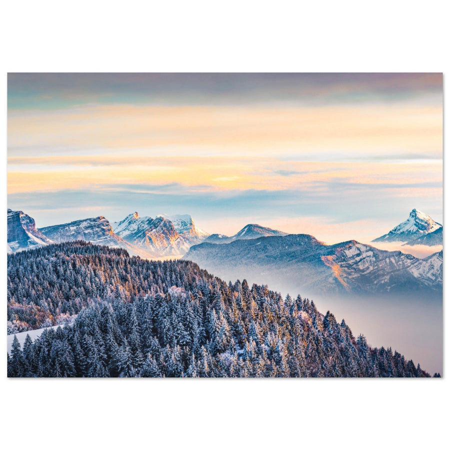
Clear snow and uncluttered landscape
Large white areas, a clear sky, and low-contrast reliefs provide breathing room. This ambiance suits bright interiors, bedrooms, and rooms where the decor already includes several colors.
Pink, mauve, or golden light
Sunrise and sunset warm the snow without erasing its freshness. These hues create an accent point above a gray, beige, or ecru sofa, and naturally interact with light wood.
Storm and high mountain
Clouds, wind, fog, and strong contrasts create a more dramatic image. The print then becomes the focal point of the room and requires more space around it.

Chalets, refuges, and villages under the snow
A human presence makes the landscape warmer. A lit chalet, an isolated refuge, or a snow-covered village evokes shelter, silence, and life at altitude. This family of images works well in a contemporary chalet, a wooden living room, or a bedroom where a purely mineral scene might appear too cold.
Frosted forest and fog
Trees repeat vertical shapes and create a more enveloping atmosphere than grand panoramas. Fog reduces depth, softens contrasts, and promotes a calm reading. A forest photograph is particularly suitable for a narrow wall, an office, or a reading nook.
The right starting point
Describe the desired effect in three words before looking at the products: for example, "bright, calm, open" or "graphic, powerful, mineral." This short list allows you to compare artworks based on their real effect, not just the prestige of the depicted location.
What snow changes in a mountain photograph
Snow simplifies the landscape, but it doesn't automatically make the image minimalist. It masks certain textures, reveals the curves of the terrain, separates forests from slopes, and transforms shadows into blue or gray masses. The result depends on the light, the sky, the proportion of rock, and the presence of human elements.
It reinforces the lines of the relief
Ridges, tracks, roads, rails, and forest edges become leading lines. In a print, they guide the eye from one edge to the other and influence the impression of movement. An ascending diagonal energizes the composition; a horizontal valley or a frozen lake produces more stability.
It amplifies luminosity differences
A lit slope can become almost white while its opposite side remains blue or gray. A very contrasted winter photograph supports a large format and distant viewing well. Conversely, a scene under a cloudy sky often presents softer transitions and appears more discreet in a bedroom.
It creates negative space
An area of snow without detail allows the main subject to breathe: hut, summit, tree, train, or silhouette. This visual space is useful in an interior already rich in furniture. It prevents the print from adding an additional layer of complexity.

To delve deeper into the reading of lines, foregrounds, and masses, the guide to composition in mountain photography shows how these elements structure an image. When making a purchase, remember that a clear composition remains easily legible at a small size, while a detailed photograph benefits from being enlarged.
What colors to choose for your interior?
Snow is never just white. It reflects the sky, sunlight, clouds, and surrounding elements. Before ordering, look at the overall dominant tone of the artwork across the entire image, not just the most spectacular colors around the summit.
White, blue, and cool gray
This palette suits contemporary, Scandinavian, and minimalist interiors. It extends white walls, gray textiles, metal, and light wood. A very cool image can, however, seem distant in a dimly lit room: the presence of a clear sky, a refuge, or a lit area then helps to balance the whole.
Pink, mauve, orange, and golden
These colors appear at sunrise or sunset. They warm up a neutral living room without transforming the print into a very colorful image. The pink of the snow in Tignes or the golden tones of the Chartreuse are particularly interesting above a beige, gray, or light brown sofa.
Gray, black, and off-white
A monochrome winter photograph emphasizes shapes, textures, and contrasts. It can integrate into a very sober palette or create a transition between wood, concrete, and metal. The guide dedicated to black and white mountain prints details the choice between soft gray and a very graphic rendering.
Dark green and brown
Forests, chalets, and rocks introduce warmer natural colors. They suit mountain-inspired interiors, provided all alpine codes are not accumulated. A simple and contemporary image balances solid wood better than an already very busy scene.

| Dominant palette | Effect in the room | Compatible materials | Watch out for |
|---|---|---|---|
| White, blue, gray | Calm, freshness, space | Light wood, metal, ecru textiles | Avoid a too cold image in a dark room |
| Pink, mauve, golden | Warmth, light, accent point | Beige, oak, gray, light stone | Compare the dominant tone with existing textiles |
| Black, gray, off-white | Graphic, sobriety, strength | Concrete, black metal, dark wood | Allow enough light and space around it |
| Dark green, brown, white | Natural and enveloping ambiance | Wood, wool, leather, stone | Avoid accumulating mountain decorations |
What type of winter landscape to choose?
The subject tells a different story and changes how the print occupies the wall. A snow-covered resort doesn't have the same density as a lake, a refuge doesn't create the same emotion as a large wall, and a railway scene attracts the eye differently than an isolated summit.
High peaks and high mountains
Peaks, glaciers, and ridges form a strong focal point. They are suitable for a large wall, a living room with distance, or an office where a sense of openness is desired. The collections of the Mont-Blanc massif, Vanoise, and Chartreuse allow you to compare very different reliefs and lights.
Resorts, villages, and chalets
Buildings provide an immediate scale and make the landscape more inhabited. A scene from Tignes or Val d'Isère works well in a living room, chalet, or secondary residence. To extend this ambiance, the collection of winter mountain photo prints brings together snow-covered landscapes, resorts, and refuges integrated into their environment.
Isolated refuges
A refuge tells the story of the relationship between humans and high mountains. Images can be peaceful, when the sun lights up the snow, or much more intense under wind and clouds. The photo prints of Alpine refuges are particularly suited to interiors where wood, stone, and natural materials already play an important role.
Lakes, valleys, and open horizons
Open landscapes bring depth and space. A winter lake, a snow-covered valley, or a succession of planes works in a smaller room, as the eye can escape towards the horizon. The Annecy photo prints offer scenes where water, the Alps, and snow create a calmer image.

Trains, roads, and tracks in the snow
A railway line, a road, or a ski track introduces a narrative and guides the eye. These images associate the landscape with an idea of movement. They are suitable for a hallway, an office, or a living room where a less contemplative and more lively artwork is desired.
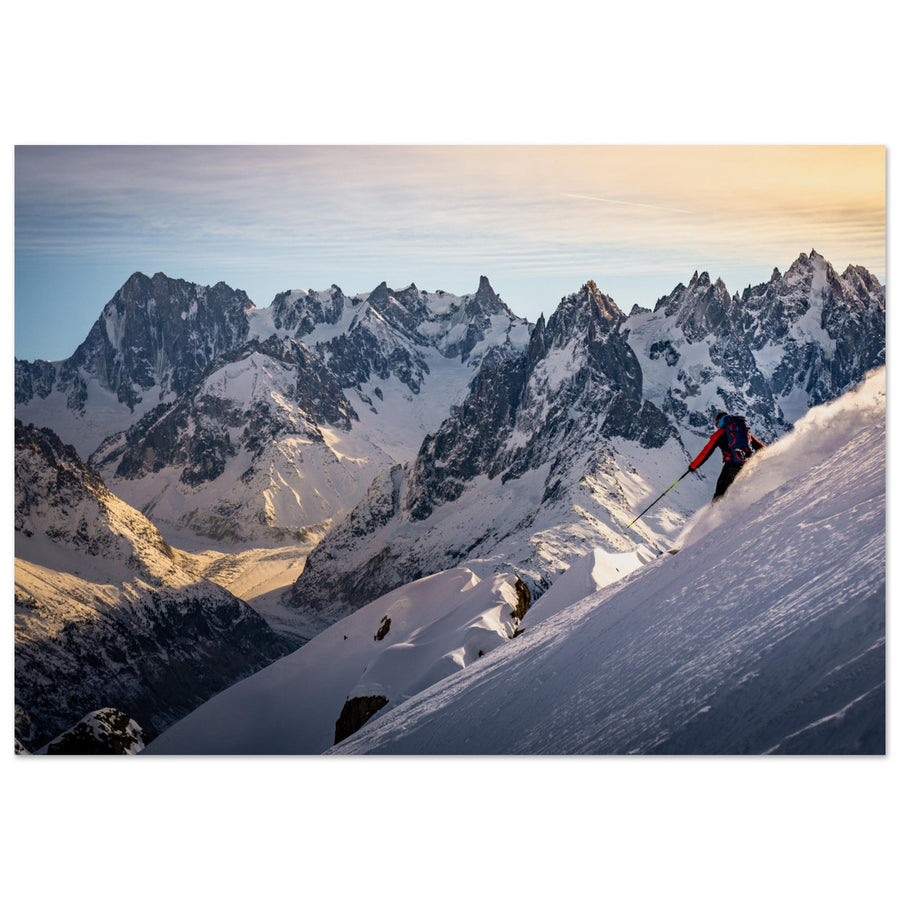
The guide on ski touring in the Alps, light, and landscape delves into the role of tracks and silhouettes. To prepare a geographical reading of the places illustrated here, also consult the guides for photographing the Vanoise and photographing the Chartreuse.
What winter print to choose depending on the room?
In a living room
The living room generally allows for a stronger artwork and a larger format. Above a sofa or a sideboard, a horizontal landscape, a panorama, or a scene structured by a ridge line works well. The photograph should remain legible from the room's entrance, but also retain details when approached.
In a bedroom
Soft light, a limited palette, and moderate contrast promote a calm ambiance. Lakes, misty forests, refuges at dawn, and large snow areas are more suitable than a very dark storm or a richly detailed resort. A horizontal format placed above the bed creates a stable line.
In a chalet
The print doesn't need to reproduce all the chalet codes. When the room already has wood, stone, throws, and mountain objects, a minimalist or graphic photograph provides a more contemporary contrast. The page dedicated to Alpine photo prints for chalets helps compare ambiances according to materials and rooms.
In an office
An open horizon, a progression in the snow, or a railway scene creates depth without constantly diverting attention. Very colorful images can be effective on a wall far from the workstation; a cool or monochrome palette integrates more easily into the direct field of vision.
In an entrance or hallway
Viewing distance is limited. Favor an immediately identifiable subject, a vertical composition, or a line that accompanies movement. An isolated summit, a refuge, a forest, or a mountain train withstands quick observation better than a panorama filled with small details.

Choosing the right orientation and size
The orientation must respect the original composition of the photograph and the shape of the wall. Forced cropping can remove a peak, flatten depth, or unbalance a ridgeline. It is better to choose a work naturally suited to the space than to transform an image to fill a precise dimension.
Horizontal format
This is suitable for valleys, villages, lakes, mountain ranges, and scenes of movement. Above a sofa or a sideboard, it follows the width of the furniture and provides stability to the whole.
Vertical format
This enhances a needle, a forest, a refuge, a cliff face, or a subject arranged on several planes. It is suitable for narrow walls, entrances, and spaces between two openings.
Panoramic format
The panorama is suitable for a large wall with enough distance. It highlights a mountain range or a valley, but requires real width to maintain the strength of the details. Discover winter mountain photo prints before comparing the proportions.
Square format
The square works with a centered or graphic composition when the original ratio of the work lends itself to it. It should not be used by default to simplify the choice: many alpine landscapes lose their grandeur when excessively cropped.
| Location | Recommended orientation | Suitable landscape | Main risk |
|---|---|---|---|
| Above a sofa | Horizontal or panoramic | Valley, mountain range, resort | Choosing a print that is too small out of caution |
| Above a sideboard | Horizontal or square | Refuge, village, lake, balanced peak | Ignoring objects placed on the furniture |
| Narrow wall | Vertical | Forest, needle, refuge, cliff face | Cropping a horizontal photo |
| Large blank wall | Large horizontal or panoramic | High mountains, glacier, ridges | Multiplying small, unhierarchical images |
| Bedroom | Calm horizontal | Mist, lake, soft snow, sunrise | Choosing too aggressive a contrast |
The guide to choosing the size of a photo print provides more precise benchmarks depending on the wall and furniture. To eliminate the main risk of error, wall simulation allows you to compare several formats directly in your room.
Matching the print to the room's materials
Light wood
Bright scenes, pastel skies, and soft grays extend the warmth of oak, pine, and natural textiles. An entirely blue image may appear colder; a touch of pink, gold, or brown creates a more harmonious transition.
Dark wood
Choose a photograph that retains enough snow or sky to avoid making the room feel heavy. A very dark print can work on a light wall, but it risks blending into an ensemble already dominated by walnut, brown leather, or dark stone.
Stone
Mineral landscapes, refuges, and snow textures naturally interact with stone. To avoid a too rustic look, a refined composition and a finish without an additional decorative frame provide a more contemporary reading.
Concrete and metal
Edges, glaciers, rails, and mountain architectures reinforce the lines of a modern interior. A scene where a red, pink, or golden element cuts through a cold palette can become the only color accent in the room.
Beige, ecru, or grey textiles
These neutral tones allow great freedom. The choice then depends mainly on the desired contrast: soft gray for calm continuity, deep blacks to structure the wall, or warm light to introduce an accent point.
Three common mistakes
- selecting a landscape simply because the location is well-known, without considering its visual density;
- choosing too small a format for a detailed photograph;
- assuming a snow print will necessarily be light, even though the sky, rocks, or forest can dominate the image.
Why matte Dibond aluminium is suitable for winter landscapes
Snowy landscapes rely on sometimes subtle differences between white, gray, blue, and shadow. The medium must preserve details in light areas, snow textures, and sky transitions. Matte Dibond aluminium offers excellent flatness and a surface that limits reflections, making it easier to read these nuances in a naturally lit room.
Each print is custom-made in France. The rigid support allows for a minimalist presentation suitable for horizontal, vertical, or panoramic formats available depending on the artwork. The matte finish does not completely eliminate reflections: orientation relative to windows and spotlights remains important.
Before hanging, check the height, the axis of the furniture, and the distance between the print and neighboring elements. The guide dedicated to installing an aluminium photo print helps anticipate these points without modifying the room's composition after receipt.

To understand the location depicted, consult the guide for photographing the Mer de Glace from Montenvers. The guide to the most beautiful high-altitude refuges in the Alps also complements the selection of inhabited winter landscapes.
Six winter photo prints to compare
These six active works cover different decorative intentions. Each photograph is attributed to its true author. Compare them based on light, density, subject, and available wall rather than a single ranking.
Tignes under snow and a pink sky
A clearly identifiable resort, a pink and blue palette, and an open composition. This work brings color to a neutral living room while maintaining a winter atmosphere.
Photography: gingerlilli
View this printChartreuse snowy at sunset
The ridges and golden light create a more mineral landscape. A strong option for a large wall, a contemporary living room, or an interior combining wood and stone.
Photography: Pierre Thiaville
View this printSnowy chalets in Val d’Isère
The buildings introduce warmth and a human scale. This image is suitable for a chalet, a wooden living room, or a bedroom where a very mineral high mountain would be too cold.
Photography: Maja Ds
View this printValette refuges at sunrise
The warm light illuminates the refuges amidst the snow. A balanced photograph for a room where both calm, human presence, and a Vanoise landscape are sought.
Photography: Pierre Thiaville
View this printValette refuge in the storm
A dense, dramatic, and graphic image. It works as a focal point on a calm wall, with enough light and distance to read the refuge in the landscape.
Photography: Pierre Thiaville
View this printMontenvers train facing the Grandes Jorasses
The red train guides the eye and tells the story of movement in the landscape. A more narrative work, suitable for an office, a hallway, or a contemporary living room.
Photography: Francois Roux
View this printThe right winter print is the one that matches the room
The best choice is not necessarily the landscape with the most snow or the most famous peak. A successful work in your interior primarily has light, a palette, density, and proportions consistent with the wall. A bright scene visually expands the space; a refuge creates an anchor point; a storm brings strength; a track or a train introduces a narrative.
Start by defining the desired ambiance, measure the wall, then compare two formats to scale. This simple method reduces hesitation and allows you to choose an alpine landscape photo print that will remain balanced as your decor evolves.