Which autumn photo print of the Alps should you choose for your home?
Autumn transforms the Alps without reducing them to a single color. Larches turn golden, meadows take on ochre tones, forests become copper-colored, while lakes, rock, and the first snows maintain blues, grays, and whites that balance the whole.
An autumn photo print in the Alps must therefore be chosen according to the desired atmosphere, the type of landscape, and the colors already present in the room. A bright image of the Queyras does not produce the same effect as a calm lake in the Vercors, a peak in the Écrins above the larches, or a more narrative scene in the Swiss Alps.
This page helps you choose a piece for your interior. To plan an outing and compare regions, consult the most beautiful places in the French Alps in autumn. To directly explore the catalog, browse the collection of autumn mountain photo prints.
What autumn ambiance to choose for your interior?
Golden larches and luminous landscapes
The yellow of larches is often easier to integrate than a very dominant red. It brings warmth without confining the room to an exclusively orange palette. Images of Lac de l'Orceyrette, Queyras, or Écrins generally combine this vegetal gold with blue, dark green, rock, and sometimes snow.
This type of photography is suitable for bright living rooms, contemporary chalets, off-white walls, and interiors where natural wood is already present. The Lac de l'Orceyrette surrounded by larches offers a calming read, while Mount Pelvoux above the golden larches produces a more monumental image.
Ochres and mineral reliefs
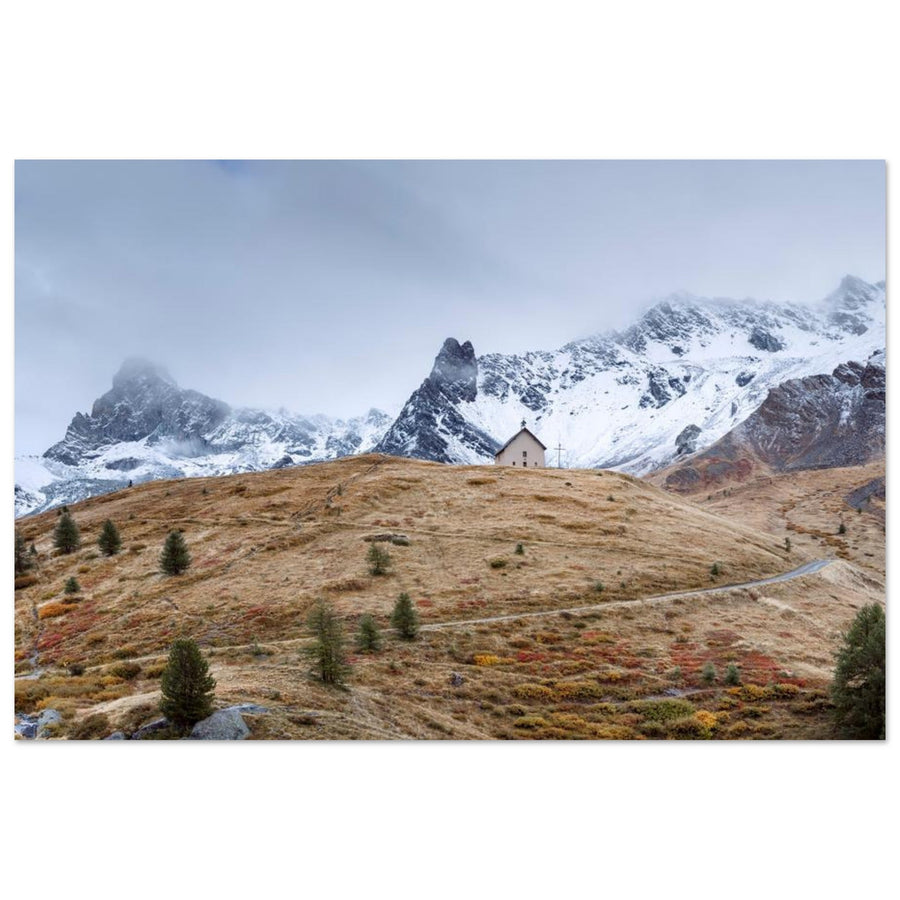
High-altitude autumn can be much more subdued than a flamboyant forest. At Col Agnel or Casse Déserte, low vegetation takes on russet and copper hues, while the rock retains grays, browns, and blacks. The composition becomes more graphic, with ridge lines, roads, and large open spaces.
These landscapes are suitable for contemporary interiors, gray walls, mineral materials, and black furniture. They bring warmth without losing the rigor of a high-mountain photograph. To learn more about the region, consult the Queyras guide, the Col d'Izoard and Casse Déserte guide, and the one dedicated to Col Agnel and Pain de Sucre.
Soft landscapes, lakes, and mists
An autumn photograph doesn't need to be highly saturated to work. An overcast sky, calm water, or a light mist simplifies backgrounds and softens colors. Lake Villard-de-Lans well represents this approach: colorful trees and reflections become the main subject, without relying on an iconic summit.
These scenes are suitable for bedrooms, offices, reading nooks, and spaces where a more contemplative presence is desired. A moderate-contrast image leaves more room for the materials and objects already present in the room.
Autumn facing the peaks and first snows
The most alpine compositions often combine warm vegetation in the foreground with cold peaks in the background. Les Drus, Aiguille Verte, Mont-Blanc, or Blüemlisalp gain depth when they emerge above autumnal forests, ochre meadows, or a deep blue lake.
This contrast works particularly well in large format: the different planes remain legible from a distance and give a real scale to the landscape. It also allows an autumn photograph to be integrated into a gray, white, or stone interior, as snow and rock balance the warm tones.
What autumn landscape to choose: lake, forest, valley, or summit?
A lake surrounded by larches
The lake provides a horizontal line and a sense of calm. The colors of the vegetation can extend into the water, but the reflection doesn't need to be perfect. A shoreline, a few rocks, or surface variations prevent overly fixed symmetry.
Lac de l'Orceyrette creates a forest and luminous atmosphere; Lac de Souliers is more mineral; Lac d'Oeschinen combines blue water, autumn slopes, and glacial reliefs. For a broader comparison of this type of composition, consult the guide Which Alpine lake photo print to choose for your interior?.
A road, a valley, or a narrative scene
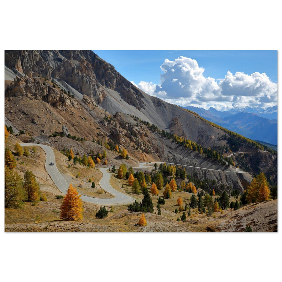
A mountain road or infrastructure integrated into the landscape gives an immediate direction to the image. The Casse Déserte guides the eye between the rocky needles; the Landwasser Viaduct and its red train add movement and history to the autumnal forest.
The Clarée Valley completes this selection with a softer interpretation of alpine autumn: river, larches, and reliefs follow one another in a valley composition. Discover the photo print of the Clarée Valley in autumn.
A summit above warm colors
Pelvoux, Les Drus, or Mont-Blanc provide an immediately recognizable anchor point. Autumnal vegetation should not only fill the bottom of the image: it should create a foreground, a line, or a transition towards the high mountains.
This category is particularly suitable for large walls. The photograph remains legible from a distance and offers several levels of interpretation: nearby colors, intermediate relief, and the main summit. The hubs for Écrins and Vercors allow for a deeper exploration of these regions without turning this buying guide into a hiking itinerary.
A forest or a more intimate landscape
Forest landscapes are suitable when seeking a sense of immersion rather than a monumental panorama. The challenge is to maintain a legible image: trunks, foliage, and branches must form planes or rhythms, and not a colored mass without a precise subject.
For a bedroom or a quiet space, prioritize a moderate palette, diffused light, and simple framing. For a living room, a forest can be associated with a second, more open print to avoid an overly dense wall composition.
What autumn palette to match your decor?
Golden yellow, beige, and light wood
The larches of Queyras and Écrins naturally complement a bright interior, light oak, linen, or cream walls. The blue of the sky or water provides the necessary breathing space to avoid an entirely yellow and brown decoration.
Copper, ochre, and mineral materials
Col Agnel, Casse Déserte, and the Savoie ridges are suitable for gray walls, stone, black metal, and more contemporary furniture. The colors remain warm, but the rock retains a clear structure.
Deep blue, gold, and white
Lakes Oeschinen or Orceyrette balance autumnal hues with water, sky, and sometimes snow. This palette works well in an already colored room, as the image does not rely solely on reds and oranges.
Dark green, copper, and mist
Forests, Vercors lakes, and diffused light scenes offer a more intimate rendering. They are suitable for bedrooms, offices, and natural spaces where the photograph should be present without becoming too dominant.
A highly saturated work can be magnificent on its own but difficult to integrate into an already busy room. Before choosing, observe the colors of the wall, curtains, floor, and furniture. The photograph should either extend this palette or create a deliberate and clearly assumed contrast.
What format to choose for an autumn photo print?
On a large living room wall
Prefer a landscape with multiple planes, an identifiable summit, or an open lake. Pelvoux, Les Drus, Grand Arc, or Oeschinen remain clearly legible from a distance. A large format should display a simple and structured composition, not just an accumulation of foliage.
Above a sofa or a sideboard
A horizontal orientation complements the width of the furniture. The line of a lake, a ridge, or a valley helps stabilize the overall look. Check the actual dimensions available on each product page and avoid a print that is too narrow compared to the furniture.
In a bedroom or office
Calm scenes, mists, and moderate contrasts are often more suitable. Lake Villard-de-Lans or Orceyrette create a softer atmosphere than the very distinct mineral reliefs of Queyras.
In a chalet
Larches, first snows, and Savoyard landscapes are naturally coherent with wood. However, it is important to maintain some breathing room: a presence of blue, gray, or white avoids a uniform accumulation of brown and orange.
Ten autumn photo prints in the Alps to discover
This selection combines lakes, larches, mineral reliefs, great summits, Vercors, and the Swiss Alps. The works were chosen for their visual complementarity and their ability to remain legible in a small or large format. Each product is active, published, and credited to its true photographer.

Lac de l'Orceyrette surrounded by larches
Calm water, golden larches, and wooded reliefs create a balanced image, immediately legible without being overly demonstrative. The gold, deep green, and blue tones are particularly suitable for a bright living room, a contemporary chalet, or a room where natural wood already plays an important role.
Photography: Francois Roux

Lac de Souliers in autumn
Lac de Souliers offers a more mineral and graphic composition. Sparse vegetation, the reliefs of Queyras, and copper tones create a work suitable for contemporary interiors, light walls, and large formats where the depth of the landscape can fully express itself.
Photography: Christophe Cappelli

La Casse Déserte at Col d'Izoard
La Casse Déserte combines mineral needles, a high mountain road, and the more discreet colors of late season. This photograph brings more contrast and character than a forest landscape. It works well in an office, an entrance, or a living room with mineral materials.
Photography: Christophe Cappelli

Col Agnel and Pain de Sucre
Upper Queyras becomes more open, colder, and more stark. The ochre slopes guide the eye towards Pain de Sucre while the sky and reliefs provide breathing room. This work is suitable for large walls where a strong alpine presence is desired without an accumulation of details.
Photography: Francois Roux

Mont Pelvoux and golden larches
The contrast between the luminous larches and the Pelvoux massif summarizes the transition between autumn and high mountains. The warm tones of the foreground balance the rock and high-altitude snows. This multi-plane composition retains its strength in a large format above a sofa or sideboard.
Photography: Francois Roux

Les Drus and Aiguille Verte in autumn
The iconic peaks of the Mont-Blanc massif overlook more colourful and closer autumn vegetation. The image retains an immediately alpine identity while offering a softer palette than an entirely snow-covered landscape. It is suitable for interiors looking for an iconic subject without too cold a rendering.
Photography: eugen_z

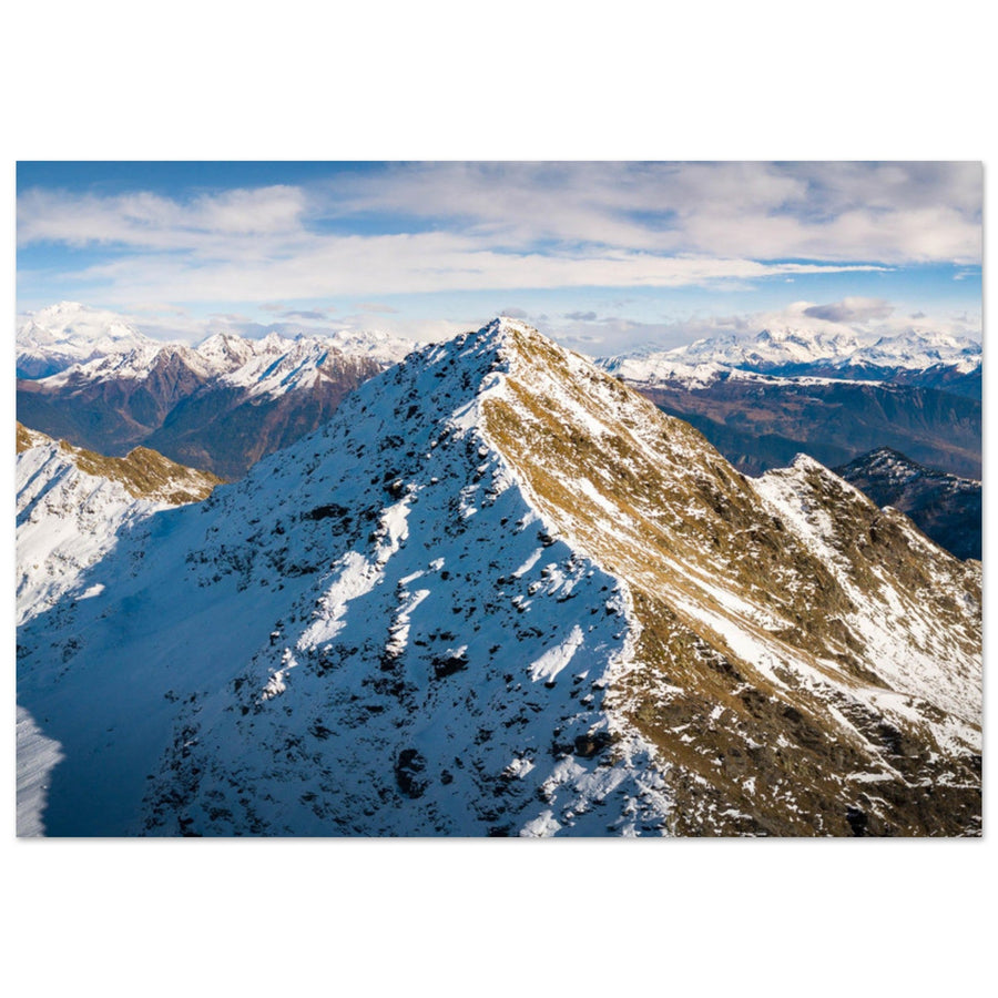
The Grand Arc ridge facing Mont-Blanc
The ridge creates a clear guiding line towards Mont-Blanc, while the autumn colours remain spread across the landscape rather than concentrated in a single block. This photograph offers a very Savoyard reading, suitable for a living room, an office, or a contemporary chalet.
Photography: Pierre Thiaville

Lake Villard-de-Lans in autumn
The Vercors offers a softer, almost pictorial atmosphere. The colourful trees, calm water, and less abrupt reliefs create a soothing image, particularly suitable for a bedroom, a reading corner, or a room where one wants a less spectacular and more intimate autumnal presence.
Photography: Pierre Thiaville

Lake Oeschinen and Blüemlisalp
The deep blue of Lake Oeschinen dialogues with the autumn slopes and glacial peaks of the Bernese Oberland. This association of cold and warm colours avoids an entirely orange rendering. It is suitable for large walls and interiors looking for an immediately recognizable alpine landscape.
Photography: Vadym Lavra

The Bernina Express at Landwasser Viaduct
The red train and the stone viaduct give a narrative dimension to the alpine autumn. The foliage frames the scene while the architecture guides the eye. This work is ideal for an office, an entrance, or a room where one wants a more dynamic image than a calm lake or forest.
Photography: Denis Belitsky
How to combine several autumn prints?
One method is to stay within the same territory: Lake Souliers with Casse Déserte, Pelvoux with another Écrins landscape, or Lake Oeschinen with the Landwasser Viaduct for a series focusing on the Swiss Alps. The location creates coherence even when the compositions differ.
A second method involves working with the palette: golden yellow and blue for a bright room, copper and grey for a contemporary interior, or dark green and mist for a more intimate atmosphere. The frames should maintain a common visual height, regular spacing, and compatible orientations.
Finally, a series can tell the story of the season's progression: still green vegetation, full golden period, then the first snow on the peaks. However, avoid mixing, without a clear intention, a highly saturated photograph, a minimalist image, and a black and white print. The guide Mountain gallery wall presents other composition principles.
Why is matt Dibond aluminium suitable for autumn colours?
Dibond aluminium offers excellent flatness and a rigid support, suitable for landscapes with multiple planes and large formats. Details of foliage, rocks, shores, and peaks remain precise without visually weighing down the image.
The matt finish limits parasitic reflections in the room and preserves the readability of warm colours, forest shadows, and snowy areas. It doesn't completely eliminate reflections but facilitates the integration of a print into a living room, bedroom, or office. Each piece is made to order in France, and available formats should be checked on its product page.
Choose an atmosphere rather than a generic season
Start by choosing a palette, then a type of landscape: calm lake, forest, valley, mountain road, or high peak. Then check for coherence with the room, wall width, and available viewing distance. A good autumn print is not just about colour intensity: it must maintain a clear composition and a natural place in your interior.